Home > Catalogue > Browse > Blue and Silver: Screen, with Old Battersea Bridge << >>
Composition

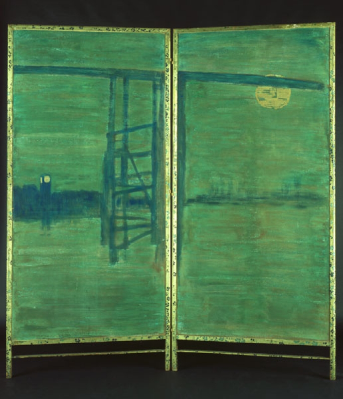
Whistler, Blue and Silver: Screen, with Old Battersea Bridge, The Hunterian

Whistler, A span of old Battersea Bridge, The Cecil Higgins Art Gallery, Bedford

Whistler, Study for 'Blue and Silver: Screen, with Old Battersea Bridge', Albright-Knox Art Gallery
The composition of the screen is closely related to the actual appearance of the site, with Old Battersea Bridge in the foreground and the new Albert Bridge behind. Several preliminary drawings, which are bisected down the middle like the screen, clearly show the Albert Bridge under construction (A span of old Battersea Bridge [M.0481], Old Battersea Bridge [M.0482], and the drawing on the recto of another sheet of brown paper, r.: Study for 'Blue and Silver: Screen, with Old Battersea Bridge'; v.: Seated nude, man in top hat; figure, buildings [M.0483]).

The new Albert Bridge, seen through old Battersea Bridge, The Hunterian

Nocturne: Battersea Bridge, Freer Gallery of Art
Related drawings include The new Albert Bridge, seen through old Battersea Bridge [M.0480], and a richly coloured pastel, r.: Nocturne: Battersea Bridge; v.: Standing Female Nude [M.0484]. It is not clear at what stage this vivid pastel was drawn.
Technique
Whistler, Blue and Silver: Screen, with Old Battersea Bridge, The Hunterian
The composition was painted on brown paper laid on canvas, which has been stretched on the back of silk with a painted design of flowers. The side painted by Whistler was examined closely and investigated technically by Dr Erma Hermens and Dr Joyce H. Townsend in the late 1990s. 1 Professor Townsend carried out materials analysis then and later: her analysis follows:
'The reddish-brown paper support was utilised as the ground colour. Whistler executed many pastels on brown paper which was often mid-toned. The screen’s support is today noticeably dark in comparison. Whistler’s technique for the screen greatly resembles that used for his pastels in the 1870s: in both cases colour was applied over a mid-toned brown support sufficiently thinly to allow the support to make an optical contribution. The layers of paint in the screen are not physically thin like strokes of pastel, but they are transparent nonetheless. They consist of underbound, coarsely-ground coloured pigments with rather a low refractive index, with a few very finely-ground ones of higher refractive index for toning. Only the thickest layers are fully covering. Part of the liveliness of the surface appearance is achieved simply through contrasts in paint thickness.
A thin layer of deep reddish blue paint was applied directly on top of the brown support, without any isolating or preparatory layer, for the shore, the pier and the arch of the bridge. This includes conventional Prussian blue and a coarsely-ground, transparent, copper-based pigment. The clock tower was gilded directly over the blue paint, with very yellow metal leaf that is likely to be genuine gold leaf. Application over the rough paint surface gave a textured appearance, and the gold was not burnished or polished, since this process is impossible without using the appropriate underlayers.
The greenish blue water and the sky were painted with considerable impasto, in predominantly horizontal brushstrokes, up to and over the reddish blue paint. The only vertical strokes were used to outline some design elements, and they have been gone over with horizontal strokes afterwards. There is a lot of scraping and rubbing down, exposing underlying layers and giving a mottled effect, as well as a locally applied brownish layer on top, of similar but paler tone to the support, made from umber, kaolin and chalk. There are local applications of cadmium orange, a pale chrome yellow, massicot, and red lake mixed with the blue pigments used for the shore. The moon on the right screen was completed at a late stage. It was painted with shell gold (which was, at this date a proprietary product made from genuine gold leaf powdered and made into a brushable paint), now extending over the greenish blue paint, on top of a smaller, circular moon which itself was painted as a ring of pale chrome yellow paint. There is no evidence for varnish on any of the paint or gold leaf, but some surface dirt is present.
The greenish blue water and sky areas both consist of a lighter greenish blue beneath and a darker greenish blue on top, and have a very matte texture. This paint is proteinaceous and water-based, most likely based on animal glue. Thus it is a distemper as used by decorators for special decorative effects, in interiors.
The dark shade was made predominantly from the copper-based pigment noted above, the light shade from Prussian blue and small amounts of the copper-based pigment, with quartz grains (probably acquired as fine sand) and extenders such as chalk and gypsum abundant in both layers. Some samples, generally of the lighter shade, included Mars yellow used to adjust the shade of different brush-strokes.
The copper-based pigment has not yet been successfully identified, and it could be a type of verdigris that includes sulphur and chlorine. ‘Verdigris’ could mean several materials at this date, but all of them did contain copper. Various methods of materials analysis made it clear that Whistler’s greenish blue material corresponds to none of the artists’ pigments available at the time: it more resembles a (cheaper) decorators' material, and in fact all the paint includes a lot of extenders, also indicative of cheap products.' 2
According to Walter Greaves (1846-1930), he purchased 'the verdigris blue' at 'Freeman's in Battersea' for Whistler, and this was used for the screen and for Harmony in Blue and Gold: The Peacock Room [YMSM 178]. 3 In fact Greaves warned Whistler that the verdigris would not last. 4 What we see now as greener paint may have changed chemically, and also changed tone since Whistler applied it.
Conservation History
Professor Joyce H. Townsend comments further:
'Since the reddish-brown paper support acts as the background colour on the painted side of the screen, and the blue and green paints were not applied opaquely, all the surface colours appear less blue than they would over a white background. The paper support has grown more brown due to light exposure, making the whole tonality of the screen closer to 'green and gold' than the 'blue and gold' of the original title. The gilded elements, applied directly over the paint, are less altered from their intended colour. Dust which could have been accumulating since Whistler's time, trapped in the coarsely-textured paint, serves to dull the colours everywhere, but without shifting their tone. The colour discrepancy between the screen’s title and its present appearance would not disappear during dirt removal from the surface.' 5
In addition, she notes, 'There was no evidence for a varnish or inordinate amounts of surface dirt. Past treatment to secure flaking paint was only evident at the extreme edges.' There has been considerable damage to the paint surfaces, including abrasion and paint loss.
The screen was reconstructed at some time, and a heavy panel was infiltrated between the recto and verso. This has caused and continues to cause stress on the painted sides and on the frame. The hinges have been replaced, as have some of the nails holding the decorated panels. This also caused some damage, although it may have been necessary in order to preserve the structure. Research continues on the methods used by Whistler, and the measures taken by later conservators.
Frame
Whistler, Blue and Silver: Screen, with Old Battersea Bridge, The Hunterian
Full Screen: 195.0 x 182.0 cm. Left Screen: 195.0 x 90.3 cm. Right Screen: 195.0 x 89.6 cm.
The frame is decorated with painted nasturtiums or laurels and a series of double lines that suggest bamboo stems, and it is signed with a butterfly. Dr Joyce H. Townsend noted:
'On the frame, the flowers were painted freehand, directly over the pale white gold, which is made from metal leaf containing both gold and silver. This was cheaper than pure gold leaf, though its tone may have been an aesthetic choice. Both shades of blue distemper paint for the flowers are made from Prussian blue and lead white, a combination Whistler used often for both frame decoration and the darker blue paint in nocturnes. Here they include a lot of extenders, again suggesting a cheap material. Grains of quartz (likely pure, fine sand) provide the texture for the paint on the frame.' 6
Notes:
1: Dr Joyce H. Townsend, Senior Conservation Scientist, Tate, now Honorary Professor (History of Art), University of Glasgow; Dr Erma Hermens, University of Glasgow, now Rijksmuseum Professor of Studio Practice and Technical Art History.
2: Professor Joyce H. Townsend, report, March 2020, GUL WPP.
3: Quoted in Marchant 1911 [more], p. 4.
4: Pennell 1921C [more], p. 122.
5: Townsend, report, March 2020, op. cit.
6: Ibid.
Last updated: 28th December 2020 by Margaret